FONTS IN USE – Brazil. Essentially Diverse
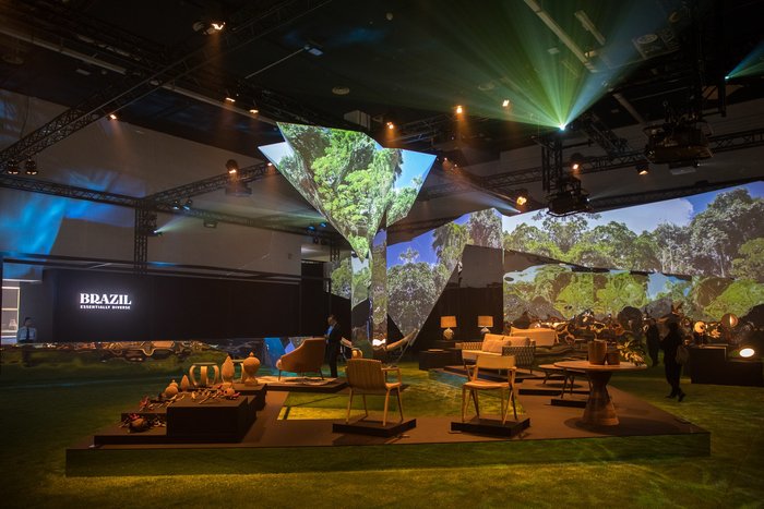
23/04/2019Brought together by a unified narrative that offers sensorial experiences, the exhibition Brazil: Essentially Diverse is an expression of the plurality and colours that sprout from Brazil, presenting the uniqueness of their material culture and focusing on its roots and transformative power.
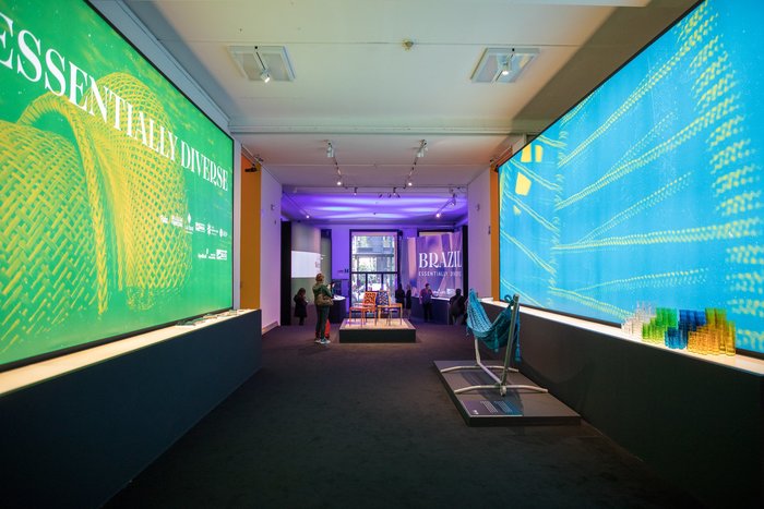
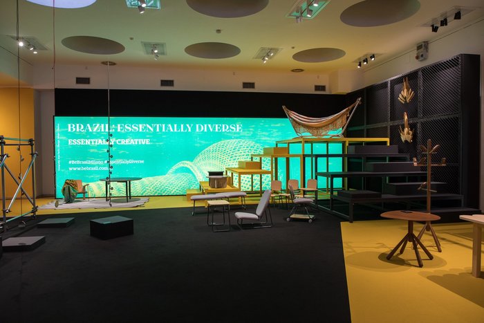
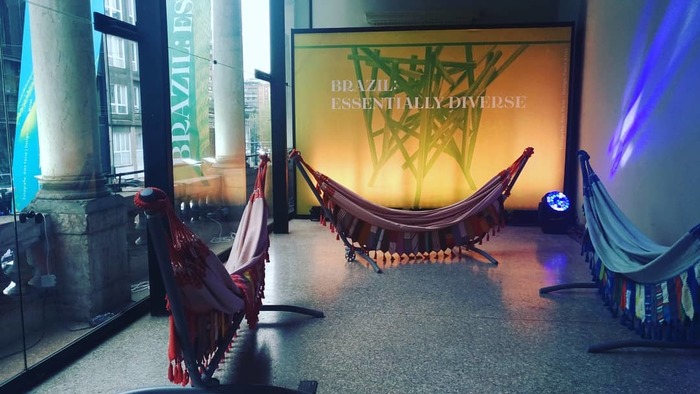
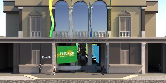
Covering the two floors of the Palazzo della Permanente in Milan, Italy, visitors were taken on a sensorial journey through four distinct zones: essentially plural; innovative; sustainable, and creative. The creations are not only to be viewed, but felt, smelt, listened to, and, yes, even tasted.
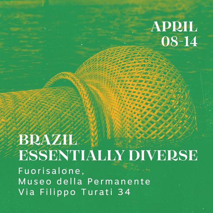
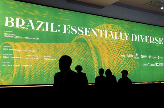
Tenez, with its distinct capital R and an elegant presence, was chosen for the title, being set in large backlit panels and signage spread throughout the exhibition.
Motiva Sans is used for supporting information and details. Few people know that Motiva is named Motiva Sans because it started out as Motiva Modern, a didone version that was in the plans, making an essentially diverse family.
Tenez has roots in this idea, even though it departs from Motiva’s proportions to become its own thing. They make a good match and it’s very nice to see them side by side on such a major event.
Curated by Joice Joppert Leal, Objeto Brasil. Scenography by Estoio Cenografia.
